

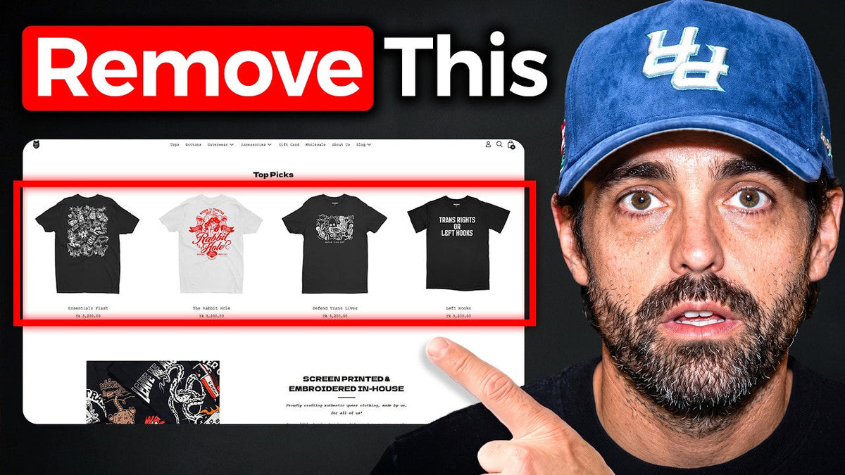
I can probably tell you what your clothing brand homepage looks like without visiting it.
A full-width hero image.
A headline centered over it.
A button that says Shop Now.
Four products underneath.
Maybe a paragraph that starts with “Welcome.”
Then somewhere along the way, you have free shipping, secure checkout and satisfaction-guaranteed badges.
There’s nothing technically wrong with any of that.
The problem is that your competitors probably have almost exactly the same website.
So does the clothing brand you think is three years ahead of you.
And so does the dropshipper selling a $19 shirt with virtually no brand behind it.
That’s where the problem starts.
Because online, looking like everyone else can make you feel cheap.
And when your website feels like it sells $19 shirts, asking someone to pay $68 for yours becomes a much harder sell.
The shirt isn't necessarily overpriced.
The website may simply be failing to make the price believable.
That distinction matters.
Your Shopify Store Is Part of the Product

We've been building Shopify stores for clothing brands and boutiques at BitBranding since 2015.
Clothing is what we specialize in.
After working inside hundreds of stores, one thing I've learned is that this isn't just a design problem.
It's a pricing problem.
Before a customer reads about your fabric weight, construction, sourcing or why you designed the product in the first place, they've already started forming an opinion about what your product should cost.
Your photography communicates something.
Your typography communicates something.
Your spacing communicates something.
Your copy communicates something.
Even your pop-ups communicate something.
Put those signals together and your customer develops an expectation of price.
If everything around a $68 shirt looks like it belongs to a bargain clothing store, the customer doesn't think:
"This must be an incredible $68 shirt."
They think:
"Why is this shirt $68?"
Same shirt.
Same materials.
Same photography.
Different frame.
Different perceived value.
So if your products aren't selling at the price you need to charge, don't automatically assume the answer is another discount.
First, look at the frame around the product.
7 Signs Your Clothing Brand Website Feels Cheap

I've noticed seven patterns that show up repeatedly on clothing brand websites.
None of them necessarily means the website is bad.
The problem is that together they make brands look interchangeable.
1. You Still Have the Theme Demo Hero

This happens all the time.
You buy a Shopify theme because the demo looks great.
The demo has a huge image with a headline and button over it.
So you replace their model with your model.
You replace their headline with your headline.
You change the button.
Done.
Except the composition wasn't designed for your brand.
It was designed by someone who had never heard of your business, for a demonstration store that doesn't actually exist.
A theme demo has to be generic.
That's its job.
Your job is to stop it from looking generic once it becomes your store.
When I install a theme, I don't want the demo to determine the brand.
I'll often start by removing most of the demo sections and then establishing the brand's typography, colors, spacing and content hierarchy first.
The theme should provide the technology.
It shouldn't provide your identity.
2. Your Product Photography Doesn't Look Like One Brand

Open one of your collection pages.
Don't look at each photo individually.
Look at the entire grid.
You might have:
-
one product on white;
-
another on gray;
-
a model photographed outside;
-
a flat lay;
-
a studio photograph;
-
an iPhone shot;
-
different crops;
-
different lighting;
-
different distances from the camera.
Any one of those photographs could be good.
The problem is what happens when they're placed together.
The collection starts looking like products gathered from different places rather than products belonging to one brand.
Premium clothing brands tend to be almost boringly consistent about this.
Same crop.
Same lighting.
Same background.
Same proportions.
Same visual language.
That consistency tells the customer there is a system behind what they're seeing.
You don't necessarily need a $20,000 photography budget.
You need rules.
Write down your photography standard:
Background:
Warm gray.
Crop:
Mid-thigh upward.
Model distance:
Consistent across every PDP and collection thumbnail.
Lighting:
Soft directional light.
Product detail images:
Front, back, fabric texture, construction detail and lifestyle.
Once you establish the system, stop breaking it.
That's what creates cohesion.
3. Your Store Is Surrounded by Discount Scaffolding

Here's another common one.
Someone lands on your website.
Within seconds they get:
GET 15% OFF!
Then there's a countdown bar.
Then a spin-to-win wheel.
Then another newsletter pop-up.
Then trust badges underneath the Add to Cart button.
Then another promotion in the cart drawer.
You're trying to increase conversion.
But you may actually be communicating something else:
"We don't think you'll buy this at full price."
Eventually customers believe you.
Worse, you train repeat customers to wait.
If shoppers know another 15%, 20% or 25% offer is probably coming next week, paying full price starts feeling unnecessary.
I'm not saying clothing brands should never run promotions.
There are good reasons to create offers.
But there's a major difference between a strategic offer and permanently surrounding your products with discount messaging.
If you're trying to sell premium products, your store needs to behave like you believe they're worth the price.
4. There's No Typography Hierarchy

Cheap-looking websites often have two typography settings:
Big.
And normal.
Every headline has the same weight.
Every paragraph has roughly the same width.
Nothing changes rhythmically as you move down the page.
The result feels more like a Word document with pictures inserted into it than a designed shopping experience.
Typography should guide the customer's eyes.
Your H1 establishes the primary message.
Your H2s break the story into sections.
Supporting copy provides context.
Small labels can communicate product details without competing with the main message.
Paragraph width matters too.
If your desktop copy stretches almost from one side of the screen to the other, you've made the customer work harder to read it.
Give the words room.
This doesn't require another Shopify app.
It requires restraint.
5. You're Using Default Colors

Pure black.
Pure white.
One loud accent color.
That's the default look of countless themes.
And that's the problem.
One of the first things I'll look at when setting up a theme is the typography and color system.
Instead of automatically using absolute black against absolute white, test a slightly softer dark neutral against an off-white or warmer background.
You don't need ten brand colors either.
In many cases, three core colors are plenty.
The exact colors aren't the important part.
Intent is.
Your colors should be there because somebody made a decision, not because that's what the theme shipped with.
6. You've Crammed Everything Onto the Homepage

When sales aren't where you want them, the natural reaction is to add things.
Another collection.
Another testimonial.
Another badge.
Another product carousel.
Another Instagram section.
Another offer.
Another block of copy.
Before long you've got 12 or 14 sections fighting for attention.
I want you to try the opposite.
Subtract before you add.
For many clothing brands, a homepage can start with something much simpler:
-
A strong hero with a clear position.
-
A featured collection or product story.
-
One meaningful piece of proof.
-
One strong reason to care.
-
A clear next step.
That's enough to build around.
Every section you add divides attention.
A page trying to communicate 12 equally important things usually communicates none of them particularly well.
Whitespace isn't wasted space.
It's one of the cheapest luxury signals available to you.
And it costs nothing.
7. Your Copy Could Belong to Any Clothing Brand

Try this test.
Cover your logo and read the homepage.
If I saw the copy without knowing which brand it belonged to, could I identify you?
Or does it say something like:
Welcome to our store. We're passionate about quality and committed to providing our customers with premium products.
That isn't really brand copy.
It's filler.
Almost any clothing company could paste that sentence onto its website.
Compare that with:
Heavyweight basics cut for guys built like linemen, not models.
Now I know something.
I know who the brand is for.
I know what problem it's addressing.
I know something about the product.
And if I'm that customer, I immediately feel like the brand understands me.
Good positioning often excludes people.
That's part of why it works.
Trying to be relevant to everybody usually makes you memorable to nobody.
Why Clothing Brands Keep Making These Mistakes
I don't think most brand owners deliberately build generic stores.
I think the process creates generic stores.
Here's the usual process:
Buy a Shopify theme.
Open the demo.
Replace its logo.
Replace its images.
Replace its text.
Upload your products.
Publish.
I call this fill-in-the-blank branding.
You inherited somebody else's composition, spacing, hierarchy and sequence and then replaced the assets.
So the skeleton of your brand was created before the theme developer even knew your company existed.
That's backwards.
Your positioning should determine the experience.
The theme should then support it.
Not the other way around.
And here's something else I've learned:
Looking cheap isn't necessarily a budget problem.
I've seen expensive websites that still feel generic.
I've also seen brands using relatively simple Shopify themes and straightforward photography create stores that feel extremely considered.
The difference isn't always money.
It's whether somebody made the decisions on purpose.
The 4 Shifts That Make a Shopify Clothing Store Feel More Premium
So how do we actually fix it?
I would start with four shifts.

Open your homepage in Shopify's theme editor.
Now go through every section and ask:
What job is this doing?
Not:
"Does this look nice?"
Ask:
"What does this section help the customer understand or do?"
If you can't answer that quickly, hide it.
You don't even need to delete it initially.
Turn the section off.
Then look at the page again.
For every section that remains, give it one purpose:
Hero: Establish positioning.
Featured collection: Give the shopper somewhere obvious to go.
Proof: Reduce uncertainty.
Brand/value section: Explain why the product deserves attention.
CTA: Move the shopper forward.
Now you have a page with hierarchy instead of a collection of Shopify sections.
Measure the result rather than relying entirely on taste.
Compare periods in Shopify Analytics and your analytics stack. Look at metrics such as product-page visits, add-to-cart rate, checkout progression and conversion rate.
The question isn't whether the shorter homepage looks prettier.
It's whether it makes the shopping decision clearer.

Next, document the visual rules for your store.
I would define at least:
Typography
-
H1 font, size and weight
-
H2 treatment
-
body font
-
button style
-
labels and captions
Color
-
primary background
-
primary text
-
accent/action color
Spacing
-
section spacing
-
content width
-
text width
-
mobile spacing
Photography
-
crop
-
background
-
lighting
-
model framing
-
detail-shot requirements
Then apply those rules everywhere.
Homepage.
Collection pages.
Product pages.
Cart.
Email.
Paid social.
TikTok content.
The goal isn't to make everything identical.
The goal is to make everything recognizably yours.
That's what premium branding often is:
consistency repeated long enough that it becomes recognizable.

Don't automatically open with products.
Open with a reason the products exist.
Instead of:
Premium Quality Streetwear for Everyone
Give me something specific.
Who is this for?
What do you believe?
What problem are you solving?
Why couldn't another clothing brand paste your headline onto its homepage tomorrow?
This matters even more now because your brand may be discovered somewhere other than your website.
A customer could first encounter you through an Instagram Reel, a creator, an ad, a shoppable video or TikTok Shop.
Shopify's TikTok sales channel can currently sync catalog, inventory, fulfillment and orders with TikTok Shop in supported markets, while TikTok Shop itself supports formats including shoppable in-feed video, LIVE shopping and product showcases.
That means your brand positioning needs to survive outside your homepage.
The website is no longer always chapter one.
Sometimes it's chapter three.
Your positioning needs to remain obvious wherever the customer enters.

This is potentially the fastest change you can make.
Stop putting all your effort into explaining why the customer should pay less.
Start explaining why the product is worth more.
If I'm looking at a $68 shirt, tell me what makes it a $68 shirt.
What's the fabric weight?
Is it 180 GSM or 280 GSM?
What's the fiber composition?
How is it constructed?
How does it fit?
What size is the model wearing?
How tall is the model?
What does the stitching look like close up?
What does the fabric texture look like?
How does it drape on a real body?
Show me.
Don't just say:
Premium Quality.
Prove it.
[VISUAL: Product page screenshot with callouts highlighting GSM, fabric composition, model height/size, fit notes, stitching close-up and lifestyle image.]
Use Shopify Metafields to Explain Why the Product Costs $68
This is where Shopify gives you a practical way to turn the strategy into a repeatable system.
Instead of manually writing important product details into every product description, create structured product metafields.
For example:
custom.fabric_weight
custom.fabric_composition
custom.fit
custom.model_height
custom.model_size
custom.construction
custom.care_instructions
Shopify metafields are specifically designed to extend product data with information that doesn't fit neatly into Shopify's standard fields. Shopify itself uses apparel care instructions as an example of the type of information merchants can structure this way.
Then connect those fields to dynamic sources inside your product template.
Now your product page can automatically show something like:
280 GSM Heavyweight Cotton
Built with a substantial hand-feel and structured drape.
Relaxed Athletic Fit
More room through the chest and shoulders without an oversized waist.
Model Fit
6'2", 225 lbs — wearing XL.
Construction
Reinforced neckline and double-needle stitching.
That is infinitely more persuasive than:
Premium Quality Shirt.
One is a claim.
The other gives me evidence.
Use Shopify Metaobjects for Reusable Proof
Metaobjects take this another step.
Shopify describes metaobjects as reusable structured content containing multiple fields, and specifically gives product highlights as one potential use case.
For a clothing brand, you could create a metaobject called:
Product Highlight
With fields for:
-
icon;
-
title;
-
short explanation;
-
image.
Then create reusable entries such as:
Heavyweight Fabric
Reinforced Construction
Garment Dyed
Made in USA
Pre-Shrunk
Ethically Sourced
Products can reference the appropriate entries through metafields, and your theme can render them consistently. Shopify supports connecting metaobject entries to products through metafield references and publishing that structured content on the storefront.
Now you're not rebuilding your benefit stack manually on 75 product pages.
You're building a system.
Change the underlying reusable content once, and you have a much cleaner way to maintain consistent merchandising across the catalog.
That's the difference between decorating a Shopify store and building one properly.
Personalization Should Support the Brand, Not Make It Messier
There's another trap I see happening as ecommerce becomes more automated.
Brands hear "personalization" and start adding more.
More recommendations.
More upsells.
More carousels.
More pop-ups.
More dynamic sections.
Again, more isn't automatically better.
Shopify's Search & Discovery tools can automatically generate related-product recommendations using signals including purchase history, product descriptions and related collections, while merchants can manually configure complementary and related products.
That's useful.
But I still want those recommendations to have a reason for existing.
If somebody is buying your heavyweight overshirt, recommend the pants that complete the outfit.
If somebody is buying a graphic tee, show the jacket used in the campaign photography.
Don't throw six random products underneath every PDP just because the theme gives you a carousel.
You can also measure recommendation click and purchase rates through Shopify's Search & Discovery reporting rather than guessing whether the recommendations are helping.
Use the technology to make the shopping experience more relevant.
Don't use it to make the page busier.
Your $68 Shirt Doesn't Need Another 15% Discount

This is the bigger point.
If a customer thinks your $68 shirt should cost $35, immediately discounting it to $57.80 doesn't solve the underlying problem.
You haven't increased perceived value.
You've reinforced the customer's suspicion that the original price wasn't believable.
I'd rather investigate why the $68 price doesn't make sense before reaching for the discount button.
Look at the entire experience.
Does the photography support $68?
Does the fit information support $68?
Does the product description support $68?
Does the fabric information support $68?
Does the homepage support $68?
Does the packaging support $68?
Does the social content support $68?
Does the brand positioning support $68?
Does your product page make the customer see why this isn't the same shirt they can buy somewhere else for $19?
That's the job.
The Premium Clothing Brand Website Checklist
If I were auditing your Shopify store today, I'd start here:
Homepage: Can I understand who the brand is for within seconds?
Hero: Does it look deliberately composed for your brand rather than copied from the theme demo?
Photography: Does the collection grid look like one brand photographed everything?
Typography: Is there a clear visual hierarchy?
Color: Does the palette feel intentional?
Spacing: Is there enough breathing room?
Copy: Could your competitor steal your headline without changing anything?
Discounts: Are you constantly telling customers not to pay full price?
Product pages: Are you proving quality or simply claiming it?
Fit: Do you give actual sizing and model information?
Materials: Do you provide composition, fabric weight and relevant construction details?
Shopify data: Are metafields and metaobjects being used to make that information consistent and scalable?
Recommendations: Are related products genuinely relevant rather than filling space?
Social commerce: Does the same positioning survive when the customer discovers the product through TikTok, Instagram or another social channel?
If several of those answers make you uncomfortable, don't automatically redesign the entire website.
Start fixing the system.
Expensive Doesn't Mean Fancy
This is probably the most important thing I want clothing brand owners to understand.
A premium Shopify store doesn't need to be complicated.
In fact, it's often the opposite.
It makes fewer decisions visible to the customer because somebody behind the scenes has already made the important decisions.
The photography matches.
The typography has hierarchy.
The colors belong together.
The copy has a point of view.
The product details justify the price.
The page has room to breathe.
And nothing looks accidental.
That's what creates the difference.
Cheap-looking stores often look the same because they were built the same way:
Pick a theme. Fill in the blanks. Add more when it isn't converting. Discount when that doesn't work.
I want you to reverse that.
Subtract before you add.
Commit to one visual system.
Lead with a position instead of a generic product grid.
Justify your price instead of apologizing for it.
None of that necessarily requires a bigger budget.
It requires somebody to make deliberate decisions about how your clothing brand should be positioned online.
Because sometimes your $68 shirt isn't overpriced at all.
Your website just hasn't earned the right to ask for $68 yet.
Want Us to Look at Your Shopify Clothing Brand?
If you're staring at your Shopify store at 11 p.m. trying to decide whether you need another section, another app, another promotion or another redesign, that's exactly the problem we built Optimized Store Owner to solve.
We've spent years working specifically with clothing brands and boutiques, and we can help you identify what's actually holding the store back instead of throwing more tactics at it.
Schedule a free strategy call and we'll take a closer look at where your brand is now, where you're trying to take it and what needs to change to get there.
Schedule Your Free Strategy Session
You don't necessarily need a new theme.
You need a better reason for every decision on the one you already have.



Share:
The Clothing Brand Offer Strategy That Actually Makes Money
The Psychology Behind Premium Product Pages