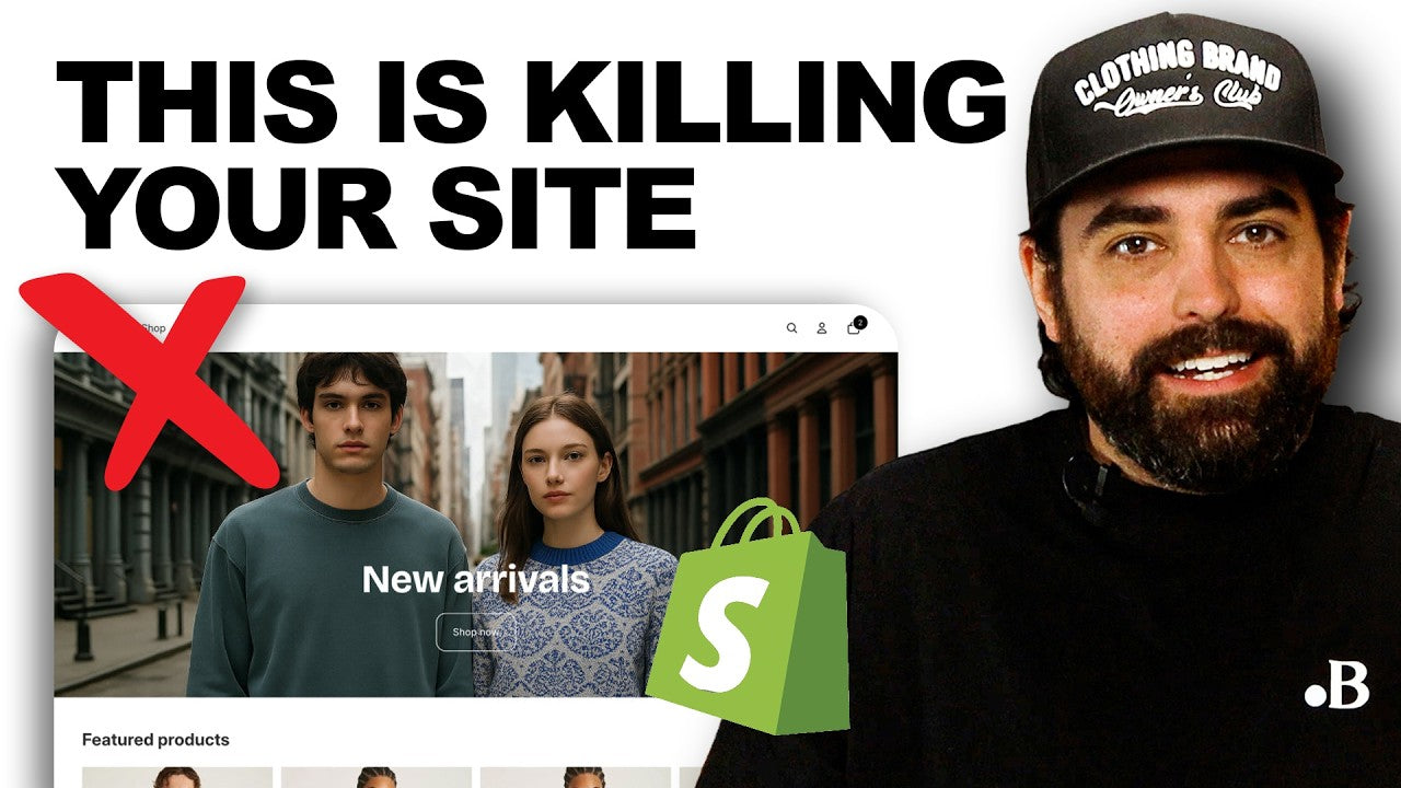
Your website is supposed to feel like a premium boutique.
But most clothing brand sites accidentally feel like a clearance aisle with a megaphone—because they “stack conversion tools” without realizing they’re stacking discount signals.
How to Make a Shopify Store Look Premium
For many apparel brands, the challenge is figuring out how to make a Shopify store look premium without completely rebuilding their site. The answer often comes down to stronger Shopify website design choices, visual consistency, and a more intentional customer experience. Premium ecommerce website design is rarely about adding more elements. It is usually about removing distractions and creating a more focused shopping journey.
Premium isn’t just a price point. It’s a feeling, and your website either creates it instantly… or quietly screams “discount brand” before anyone scrolls.
Below is a tactical, Shopify-execution-first version of the article with:
-
Technical specifics (Metaobjects, Metafields, theme settings, app restraint, speed workflows)
-
Visual evidence (exact screenshot checklist + before/after examples you can replicate)
-
Modern growth context (social commerce, AI personalization, TikTok Shop, onsite experiences)
The Premium Rule (Quick Diagnostic)
A premium site tends to be:
-
Calm (one message, one next step)
-
Controlled (tight typography + palette)
-
Cohesive (consistent visuals)
-
Fast (stable, frictionless)
If you’re doing the opposite, you’re not “optimizing”—you’re training customers to wait for discounts.
Detail #1: Pop-Up Overload = Instant Discount Vibes

What it looks like (the “clearance aisle” stack)
When someone lands on your homepage and immediately sees:
-
10–15% off pop-up
-
spin-to-win wheel
-
countdown timer
-
sticky promo bar
-
chat bubble
-
email capture + free shipping banner
…they don’t feel welcomed. They feel ambushed.
Why it kills premium conversion
If your first interaction is a discount, you train visitors to:
-
wait for a code
-
leave and return later
-
assume your product needs a bribe to be purchased
That’s not a conversion system. That’s a discount dependency system.
Premium Fix: Calm, Clear & Focused Homepage (Shopify execution)
A) Build a “Single Hero + Single CTA” above the fold (Shopify theme steps)
In Shopify → Online Store → Themes → Customize:
-
Open your homepage
-
Find the Slideshow / Image banner / Hero section
-
Delete extra slides so only 1 remains
-
Set:
-
Headline: one line that communicates vibe + value
-
Button: one primary CTA only (e.g., “Shop New Arrivals”)
-
Remove competing elements above the fold:
-
additional CTA buttons
-
multiple badges
-
“limited time” timers
Goal: One message. One next step.
B) Replace instant pop-ups with “Teaser-first” email capture (Klaviyo or similar)
Instead of an immediate modal, implement one of these:
Option 1 (Best premium): teaser / embed section
-
Use a small teaser bar at the bottom (non-blocking)
-
OR add an email capture section near the bottom of the homepage and product pages
Option 2 (If you must use a pop-up): delay + intent-based triggers
-
Trigger only on:
-
exit intent
-
2nd page view
-
time on site (e.g., 20–40 seconds)
-
Don’t show it on the homepage for all traffic.
Premium behavior: Earn attention first, ask second.
Visual evidence you can add (before/after)
Add these directly into your blog post as screenshots:
Screenshot set (do this today)
-
Before: homepage above-the-fold with pop-ups / banners visible
-
After: homepage with one hero, one CTA, no modal on load
-
Before: email pop-up firing at 0–3 seconds
-
After: teaser embed at bottom + delayed intent trigger
How to capture it:
-
Use your browser dev tools + a scrolling screenshot extension
-
Or record a 10–15s screen capture showing the first impression
Why Shopify Store Design Influences Perceived Value
A common mistake in Shopify store design is assuming that more tools automatically create a better experience. In reality, excessive pop-ups, competing messages, and unnecessary promotions often reduce perceived value. One of the most effective forms of Shopify store optimization is simplifying the customer journey so visitors can focus on the products instead of the distractions.
Detail #2: Template Tells That Cheapen Your Site

Premium brands can use templates. They just don’t feel like they did.
What gives it away?
-
messy typography
-
random colors
-
inconsistent buttons
-
mismatched spacing
This is the fastest way to make a Shopify theme feel “default.”
Premium Fix: Build a simple design system (with Shopify controls)
A strong design system is one of the foundations of luxury e-commerce design. Consistent typography, spacing, colors, and imagery help create a more polished experience that customers associate with premium brands. Whether you are working with a custom build or using Shopify theme customization, consistency often matters more than complexity.
A) Typography: Two fonts max + controlled weights
In Shopify → Theme editor → Theme settings → Typography:
-
Choose 1 Headline font
-
Choose 1 Body font
-
Keep weights consistent:
-
Headlines: 600–700
-
Body: 400–500
-
Buttons: consistent casing + weight
Common technical problem: apps override fonts.
-
Reviews apps, sticky ATC, bundles, pop-ups often inject their own CSS.
Execution check:
-
Open 3 pages: home → collection → product
-
Look at:
-
headings
-
body text
-
button text
-
badges
If any element uses a different font or weight, it breaks “premium.”
B) Color palette: 1 primary + 1 neutral + 1 accent (and enforce it)
In Shopify → Theme settings → Colors:
-
Set a neutral base (background + text)
-
Set a primary color (main CTA)
-
Set an accent color (used sparingly for highlights only)
Avoid:
-
different shades of “blue” for links vs buttons
-
neon “sale” badges that conflict with your palette
-
random announcement bar colors
Visual evidence: the “blur test” screenshot
Do this:
-
Take a full-page screenshot of your homepage
-
Shrink it down to 10–20% zoom
-
Squint / blur your eyes
If it looks like a rainbow of competing elements—your site is not premium.
Add the “blur test” screenshot into the article as a proof point (it’s extremely persuasive and simple).
Detail #3: Generic Visuals Destroy Premium Perception

Nothing kills premium faster than:
-
stock-looking photos
-
inconsistent lighting
-
mixed editing styles
-
random lifestyle shots that don’t match
Premium photography is cohesive: same lighting, same editing, same vibe.
Premium Fix: Cohesive visual system (Shopify workflow + reuse)
A) Create a “photo treatment rule”
Even if you shoot on iPhone, you can be premium if you standardize:
-
background type (studio / outdoor / indoor)
-
light direction (soft front light vs harsh)
-
crop rules (how tight, model framing)
-
editing preset (same contrast and tone)
B) Enforce consistency across product grids (collection pages)
Your collection page is your “boutique wall.”
Execution check:
-
Do all product tiles look like they belong to the same brand universe?
-
Are some images bright white while others are warm/dark?
-
Are some modeled and others flat-lay?
If yes → you’re broadcasting inconsistency.
Why Clothing Brand Website Design Requires Structure
Many clothing brand website design projects struggle because product pages evolve without a consistent structure. Standardizing how information is displayed helps maintain brand quality across collections and supports a more premium customer experience as your catalog grows.
Technical specific: Use Metafields to standardize product media and messaging
Premium perception isn’t just photos—it's consistent presentation at scale.
Use Shopify Metafields for repeatable product structure
Shopify Admin → Settings → Custom data → Products → Add definition
Create metafields like:
-
custom.material (single line text)
-
custom.fit (single line text)
-
custom.weight_gsm (number)
-
custom.made_in (single line text)
-
custom.care (rich text)
-
custom.size_notes (rich text)
-
custom.feature_1 / feature_2 / feature_3 (text)
Then in your theme:
-
add a “Product details” block pulling these metafields
-
keep the layout consistent across every SKU
This prevents each product page from being improvised and messy.
Even better: Use Metaobjects to build reusable “premium modules”
Metafields are great for values. Metaobjects are great for structured, reusable blocks.
Example: Reusable “Premium Detail Stack” across SKUs
Use case: You want the same benefit stack layout across 50 products, but with different attributes.
-
Shopify Admin → Content → Metaobjects → Create definition
Create a Metaobject called: Product Feature Stack
Fields: -
Feature title
-
Feature description
-
Icon (image/file)
-
Optional: “proof note” (e.g., lab tested, 300gsm, reinforced seams)
-
In Custom data → Products, create a metafield:
-
Type: Metaobject reference
-
Name: Feature stack
-
On each product, select the right Feature Stack entry.
Result:
-
consistent, premium layout everywhere
-
faster merchandising
-
fewer “template tells”
-
scalable storytelling without clutter
Visual evidence: add a “before vs after” product page module screenshot
Include two screenshots:
-
Before: product page with messy, inconsistent feature bullets
-
After: a clean, reusable Metaobject-driven feature stack with icons + spacing
When evaluating how to make a Shopify store look premium, speed should be treated as a design element rather than just a technical metric. Even the best Shopify website design can feel less premium when pages load slowly or interactions feel delayed. A fast experience reinforces quality and trust.
Bonus Premium Detail: Speed (Premium customers bounce fast)

A premium experience is smooth.
If your site is slow, glitchy, or jumpy, it doesn’t matter how good your branding is—people leave.
Practical benchmark
Aim for:
-
1–2 seconds ideal
-
2–3 seconds acceptable
Above that, conversion suffers.
Shopify speed killers (and what to do)
A) Too many apps (technical reality)
Every app can add:
-
scripts
-
network requests
-
render-blocking resources
-
DOM bloat
Execution audit:
-
List all apps installed
-
For each app ask:
-
Does it increase AOV/conversion measurably?
-
Can Shopify native features replace it?
-
Can we load it only on product pages instead of site-wide?
Premium brands are ruthless here.
B) Unoptimized images/videos (premium motion without premium lag)
Best practice for homepage video:
-
short (6–12 seconds loop)
-
1080p often enough
-
compress aggressively
-
test with and without
Execution:
-
Run a page speed report
-
Record load time before/after adding video
-
Keep motion only if it improves conversion without killing speed
Visual evidence: show performance proof
Add:
-
a screenshot of PageSpeed/Shopify performance before cleanup
-
a screenshot after removing 1–3 heavy scripts/apps or compressing a hero video
Even a simple “load time improved from ~X seconds to ~Y seconds” style note increases credibility dramatically.
Modernize the Strategy: Premium ≠ Just Ads (Use Social Commerce + AI Personalization)

A premium site isn’t just for Google/Facebook traffic anymore.
Today’s growth is multi-channel, and premium perception must hold up across:
1) TikTok Shop + Social Commerce
When someone taps from TikTok Shop or Instagram:
-
they decide instantly if your brand is legit
-
your site must match the vibe of the content that drove the click
Premium execution:
-
landing pages that match the creator/video aesthetic
-
minimal friction checkout
-
fast loading product pages
-
consistent visuals from social → PDP
2) AI-driven personalization (what premium brands are adopting)
Premium brands use personalization carefully—without making the site feel spammy.
Examples of premium-feeling personalization:
-
“Recommended based on your browsing” (subtle, below fold)
-
dynamic “Complete the look” modules
-
size guidance based on returns and fit feedback
-
personalized homepage sections for returning customers
Key: personalization should feel like a concierge, not a salesperson.
3) Onsite merchandising that supports “drops”
For clothing brands running drops:
-
“New Arrivals” must feel curated, not cluttered
-
use clean collection templates
-
emphasize story + cohesion, not discount urgency
Quick Implementation Checklist (Copy/Paste)

Above the fold (Homepage)
-

One hero visual
-
One headline (vibe + value)
-
One CTA
-
No modal pop-up on load
-
Email capture = teaser or lower-page section
Design system
-
Two fonts max, controlled weights
-
Tight palette (primary + neutral + accent)
-
Buttons consistent across every page
-
Remove “random” app styling overrides
Product page consistency (technical)
-
Product metafields for core attributes (fit/material/care/etc.)
-
Metaobject “Feature Stack” for reusable premium modules
-
Consistent image treatment across SKUs
Performance
-
Remove nonessential apps/scripts
-
Compress images and videos
-
Test load time before/after any motion content
Modern growth readiness
-
Landing pages match social content aesthetics
-
Subtle personalization (not aggressive pop-ups)
-
Mobile-first speed and stability
Turning Premium Design Into Long-Term Growth
Premium brands understand that great design and great marketing work together. Effective clothing brand marketing starts with a website that reflects the quality of the products being sold. Whether through Shopify design services, Shopify theme customization, or ongoing Shopify store optimization, the goal is to create an experience that feels valuable before a customer even reaches checkout.
Working with a Shopify web design agency can help identify design inconsistencies, performance issues, and opportunities to strengthen the overall customer journey. The best Shopify design services focus on building long-term brand value rather than relying on constant discounts to drive sales.
Want a Premium Store Strategy Built Around Your Brand?
If you want help turning your Shopify store into a premium conversion machine—without relying on discount tactics:
You’ll walk away with clear priorities for:
-
product page structure using Shopify custom data
-
speed improvements
-
modern growth channel readiness (TikTok Shop + social commerce + personalization)


Share:
The Real Reason Clothing Brands Fail
The Science Behind Scaling a Clothing Brand ($0 - $1M FAST)