When I first launched my Shopify clothing store, I thought I had everything figured out. I spent weeks obsessing over color palettes, product photos, and fonts. I built what I believed was a “beautiful” homepage — clean design, smooth animations, and catchy slogans. But there was one huge problem:
it wasn’t converting.
Visitors were landing on my site and leaving almost immediately. My traffic numbers looked decent, but my sales? Practically non-existent.
After countless late nights staring at analytics dashboards and wondering what I was doing wrong, I decided to take a completely different approach. Instead of guessing, I studied.
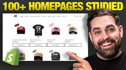
I analyzed over 100 of the best-performing Shopify clothing brands — every homepage layout, headline, product grid, and call-to-action. And what I found changed everything.
In this article, I’m breaking down the exact homepage strategy that transformed my failing Shopify clothing store into a profitable online brand. If you’re struggling with low conversions or unclear branding, this might just be the missing piece.

Why Your Homepage Needs to Convert — Not Just Look Good
Let’s start with a painful truth: most Shopify clothing stores look good but don’t sell well.
Your homepage isn’t a portfolio. It’s not just there to “look aesthetic” or to show off your photography. It’s your store’s conversion engine — the place where you have to grab attention, build trust, and make people buy.
According to research, users spend 57% of their time above the fold — meaning the part of your homepage they see before scrolling. If that section doesn’t clearly communicate what you sell and why it matters, you’ve already lost them.
When I compared high-performing brands to struggling ones, the difference was clear. The top stores weren’t using fancy animations or vague slogans. They had something much simpler and far more powerful:
-
One strong headline that instantly communicated value
-
A high-quality lifestyle image or video that showcased their product in action
-
A single, clear call to action (CTA)
That’s it. Simple, direct, effective.

The Hero Section: Your Store’s 3-Second Billboard
Think of your homepage like a billboard on the busiest highway in your city. You’ve got three seconds to grab someone’s attention before they move on.
When a visitor lands on your homepage, they should immediately know:
-
Who you are
-
What you sell
-
Who your products are for
-
Why your brand is different
If they can’t answer those questions within seconds, they’ll leave — no matter how pretty your design is.
For example, the brand Tecovas (known for its premium cowboy boots) nails this perfectly. Their homepage hero section features a short video showing their craftsmen making boots by hand. The headline reads: “How we make them, one step at a time.” And the CTA simply says: “Learn More.”
It’s clean, authentic, and clear. You instantly understand what the brand sells and what they stand for.
Another great example is Quince, a minimalist clothing brand. Their hero section displays a simple grid of images featuring models wearing their products. The headline says: “Timeless. Soft. Fairly priced.” followed by a single CTA: “Shop Sweaters.”
No fluff. No confusion. Just clarity.

Personalized Hero Sections Are the Future
Many of the best brands in 2025 have started personalizing their homepage hero sections.
For example, when a returning customer visits, the site might automatically display products for men or women based on their previous shopping behavior. It’s a subtle shift, but it makes the experience feel more tailored and relevant — and that boosts conversions dramatically.

Navigation: Keep It Clean, But Smart
The next big win I discovered was in navigation.
Top-performing clothing stores have clean, well-organized menus. But “clean” doesn’t mean “empty.” It means the structure is intentional.
Every great clothing store homepage I studied included essential categories like:
-
New Arrivals
-
Bestsellers
-
Featured Collections
-
Brand Story or “About” links
But beyond that, organization was everything.
The best brands don’t just sort by gender or product type. They think about the shopper’s intent. Maybe someone’s shopping for a gift. Or for a specific occasion.
Imagine having a menu section like “Gifts for Her” or “Cozy Essentials for Fall.” These kinds of collections help guide the shopper toward what they need without overwhelming them.
And speaking of guidance — mega menus are a game changer.
Hover over a “Women’s” tab on brands like Natural Life or Quince, and you’ll see beautifully organized dropdowns with categories like “New Arrivals,” “Bestsellers,” and “Fall Collection.” Some even use small images or icons to help customers visualize the category.
It’s not just navigation — it’s persuasion through design.

Social Proof: More Than Just Reviews
When you think of social proof, you probably imagine a section at the bottom of a page with a few testimonials or star ratings.
But in 2025, that’s not enough.
The best clothing brands now integrate trust signals throughout the homepage — not just in one place.
Here’s how they do it:
-
Displaying star ratings directly beneath featured products
-
Highlighting UGC (user-generated content) in mid-page sections
-
Including press mentions or influencer collaborations right after the hero banner
For example, Beyond Yoga has a section called “See It IRL” (In Real Life). It features videos from real customers showing how their leggings move and fit. You can hover over the videos, and they auto-play — giving you a realistic feel of the product without ever leaving the homepage.
Similarly, True Classic showcases their credibility right under their hero video with text like:
“5+ million happy customers, 300k 5-star reviews, and a 100-day perfect fit guarantee.”
It’s instant social validation. Visitors immediately trust them.
Even smaller brands like O’Poly display star ratings under every product thumbnail, reinforcing trust at every stage of the browsing experience.
My takeaway? Don’t hide your credibility. Flaunt it.

Product Discovery Starts on the Homepage
Here’s another massive mistake I made early on: I treated my homepage like a “teaser” — something to get people excited enough to click into collections.
But here’s the problem: most shoppers don’t click.
The average user views only 1.5 pages per session. That means if your homepage doesn’t show products right away, you’re losing out on sales.
Top-performing stores highlight bestsellers, trending items, and personalized recommendations right on the homepage.
Why? Because 43% of shoppers in 2024 said they bought something they weren’t planning to simply because it was recommended to them on a homepage or product page.
That number is only going to rise.
For instance, Natural Life curates sections like “Perfect Things for Fall,” highlighting seasonal items and giving customers an instant reason to buy.
But the key here is the copywriting — instead of using generic titles like “Featured Collection,” they use emotionally resonant language that fits their brand voice.
If you run a streetwear brand, maybe your section header says “Drops You’ll Actually Wear” instead of “New Arrivals.”
If you sell sustainable basics, try something like “Wardrobe Staples That Do More Good.”
Your copy should feel like part of your brand identity — not just filler text.

Storytelling: The Secret Sauce Most Brands Miss
This next part changed everything for me.
The most successful clothing brands don’t just sell products — they sell stories.
When I looked at the top-performing homepages, every single one of them blended commerce with content. They didn’t just dump a grid of products; they wove storytelling elements throughout the page.
Take Marine Layer, for example. They don’t just show clothes — they tell you about “The Science of Flex Terry” and how they developed unique fabrics that no one else uses. It’s subtle, but it builds emotional connection.
Or look at Verity, a brand that integrates values like sustainability and community right into their homepage with sections titled “Reduce. Rewear. Relove.”
They’re not just selling clothes; they’re selling a lifestyle — a cause.
As the saying goes:
“People don’t buy clothes. They buy identity.”
Your homepage should make that identity clear.
If your brand uses eco-friendly denim, don’t just say “Shop Sustainable Jeans.” Tell a micro-story like:
“Each pair saves over 2,000 gallons of water compared to traditional denim.”
Now your product has meaning. It’s not just apparel — it’s a statement.

Mobile Optimization: Beyond Just “Responsive Design”
Yes, Shopify automatically adjusts your layout for mobile. But the best stores don’t stop there — they design for mobile intentionally.
That means:
-
Enlarging buttons and CTAs for thumb-friendly clicks
-
Adjusting image ratios for smaller screens
-
Using shorter, punchier headlines
-
Choosing mobile-specific visuals instead of just shrinking desktop versions
Top brands rethink their entire homepage flow for mobile — making it just as intuitive and engaging as desktop.
If your mobile experience feels clunky, you’re leaving money on the table.

The Footer: Your Store’s Closing Argument
Most brands completely ignore their footer. But smart brands use it as one last opportunity to convert visitors.
Think of your footer like the closing argument in a trial — the final chance to make your case.
If someone has scrolled all the way down, that means they’re interested. Don’t let them leave without giving them a reason to stay connected.
Here’s what winning footers include:
-
Quick links (Returns, Size Guide, Find a Store, FAQs)
-
Trust badges (e.g., Certified B Corporation, secure payment icons)
-
A compelling email opt-in with an incentive (like 15% off first order)
-
Business contact info and hours of operation
Brands like Faherty do this beautifully — their footer includes everything from store locator links to a “15% Off” sign-up offer.
Meanwhile, Natural Life adds personality to theirs by calling their newsletter “The Daily Chirp” — a lighthearted way to invite customers to subscribe for daily motivation and “heart and soul.”
These touches might seem small, but they make your brand feel human, authentic, and worth engaging with.

Design Details That Set You Apart
Some brands go the extra mile with small but powerful visual touches — like custom-designed icons that represent their values or services (e.g., “Free Returns,” “Ethically Made,” “Fast Shipping”).
Instead of using generic graphics from Google or stock libraries, they design icons that perfectly match their brand’s color palette and tone.
It’s these little details that make your store feel premium — the kind of brand people remember.

The Strategy That Saved My Shopify Store
When I rebuilt my homepage using everything I learned from those top Shopify clothing brands, the difference was immediate.
My bounce rate dropped by over 40%.
Visitors were scrolling deeper, clicking more, and — most importantly — buying.
The transformation came from focusing on one principle:
A homepage should tell a story, guide the shopper, and inspire action — all in under 10 seconds.
Here’s the checklist I now use (and you should too):
-
Clear Hero Section: Strong headline, emotional imagery, single CTA.
-
Smart Navigation: Organized menus that guide shoppers effortlessly.
-
Visible Social Proof: Star ratings, UGC, press mentions, and trust signals throughout.
-
Product Discovery: Show bestsellers and personalized recommendations right on the homepage.
-
Storytelling: Weave your mission, values, and product stories into the layout.
-
Mobile Optimization: Design mobile-first, not just mobile-friendly.
-
Conversion-Driven Footer: Include links, contact info, offers, and trust badges.
When I applied this strategy, my “pretty but empty” homepage finally became a sales machine.

Final Thoughts
Your homepage isn’t just a digital storefront — it’s the heart of your brand experience. It’s where trust is built, stories are told, and conversions are made.
If your Shopify clothing store isn’t performing the way you want it to, start here. Rebuild your homepage with purpose, clarity, and strategy.
Remember, people don’t buy products — they buy what those products say about them.
Make your homepage tell that story clearly, confidently, and beautifully.
That’s the strategy that saved my Shopify clothing store — and it might just save yours too.


Share:
NEW Instagram Ads Strategy For Clothing Brands 2026
The FREE Instagram Strategy Clothing Brands Are Sleeping On