This site uses cookies for better user experience and analytics.
by Sandeep Verma
What's the difference between mobile friendly and mobile responsive?
by Sandeep Verma
Nowadays developing websites for mobile devices is a must and for a lot of people the label ‘mobile friendly’ and ‘mobile responsive’ mean the same thing. And they kinda do. One is the outcome and the other is the process. Let me explain. According to Google, mobile friendly can be defined as,usable on a mobile device (e.g. the site doesn't slow down the phone, doesn't scroll horizontally in a vertical orientation, doesn't use unavailable plugins like Flash). It's designed for the form factor of the device and its display. (https://developers.google.com/search/mobile-sites/glossary)So mobile friendly is the outcome you want to achieve with your website. If you don’t know if your website is mobile friendly you can check this tool,Mobile Friendly Test. Now let me explain the best approach to a mobile friendly website.
Not mobile friendly
Mobile friendlyMobile responsive or responsive web design (RWD) is an approach to website design that delivers the same HTML code on the same URL regardless of the device -- desktop, laptop, tablet, phone -- but can show the display differently based on the screen size. This is BitBranding’s recommended approach. Back in the day there were other options such as creating a completely different version of your site just for phones. This has been replaced with RWD because of the emergence of multiple sized mobile devices and tablets. In the United States, average time spent using the internet on mobile devices per day is 3.1 hours compared to 2.2 on desktop and tablets. (http://www.kpcb.com/internet-trends) This number has increased year over year. The implications are clear -- if you’re not able to reach your audience through mobile devices you’re not providing a satisfactory experience and you will lose customers to competition that are equipped with mobile friendly websites. Internet Trends 2017 - Code Conference by Mary Meeker | Kleiner Perkins Now you’re probably asking yourself how do I get my website to be mobile friendly using responsive web design? Well there are many options out there and nowadays website builders like, SquareSpace and Webflow, allow you to create these but if you’re looking for a professional to help you with a mobile friendly website then we can help you out. Simply click on the link below to get started. Get a free quote
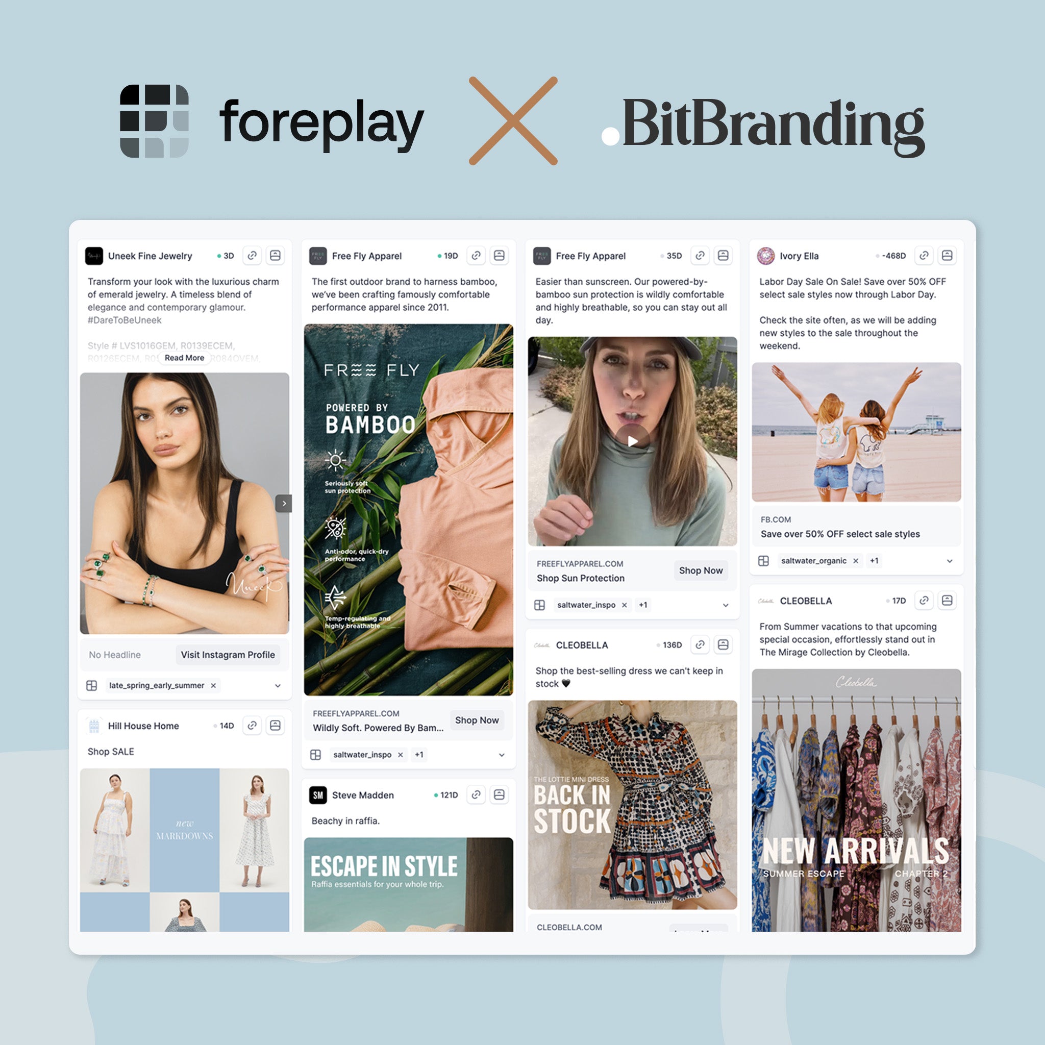
If your Facebook Ads strategy still looks like it did in 2020—stacked ad sets, layered interests, and random budget splits—you're burning money. Meta has changed the game, and what worked even a year ago might now be killing your results....
In today's digital age, Instagram stands out as a pivotal platform for individuals and businesses alike, aiming to grow their presence online. However, many find themselves at a standstill, unsure of how to expand their follower base. This guide offers...
Hey guys! In this blog, we're going to show you how to optimize product images for Shopify. I want to thank you for consuming our content. That really means a lot to us. This year we actually turned five years...


 Internet Trends 2017 - Code Conference by Mary Meeker | Kleiner Perkins Now you’re probably asking yourself how do I get my website to be mobile friendly using responsive web design? Well there are many options out there and nowadays website builders like, SquareSpace and Webflow, allow you to create these but if you’re looking for a professional to help you with a mobile friendly website then we can help you out. Simply click on the link below to get started. Get a free quote


Share:
12 reasons social media dominates customer care
How to Install the Facebook Tracking Pixel on Your Website