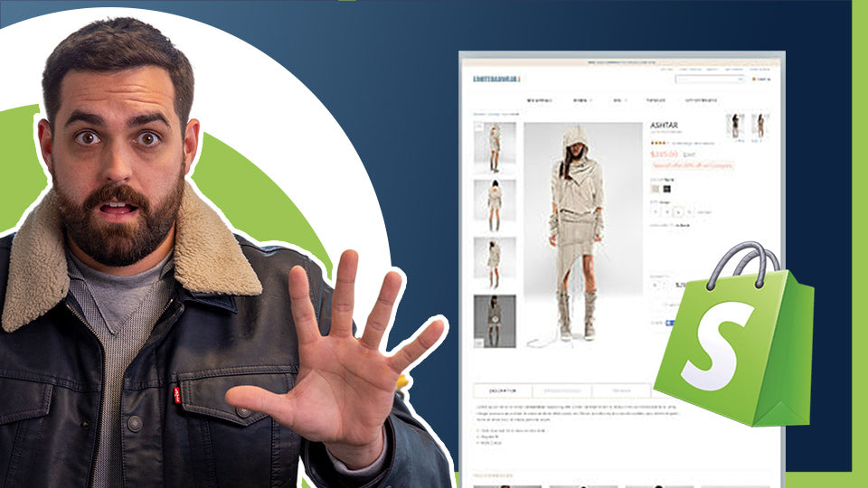
Welcome to the BitBranding Channel. We’re going to show you the top 5 things you need in your product page.


That’s why in this blog, we’re going to show you the top 5 things you need in your product page, including one app that will help you increase your conversion. Stick around to the end to learn more.
As always, before we get started we just want to say welcome to everyone new. My name is Christian Piñon and I am one of the co-founders here at BitBranding.

We've been helping frustrated store owners since 2015 become more impactful store owners through tutorials, tactics and strategies. If you want to support our YouTube Channel, make sure to hit that subscribe button and turn on notifications.


1. Good Quality And Variety Of Images
Let’s get started with number 1 which is good quality and a variety of images.

This is the single most important element of an e-commerce product page. Your featured image can excite visitors, or worse, turn them away. It has to be polished and it has to be perfectly centered. Think of a clean cut image, maybe with a nice and simple white or black background, doesn’t have to be too fancy, no crazy edits, nothing like that. Now, whenever we talk about a variety of photos, we mean variety. Let’s say you’re selling a shirt. The photos could be the front of the shirt or the back of the shirt. Maybe think about zooming in on certain areas or aspects of the shirt, like if it has a tag on the side or something, you could definitely zoom in on that. Depending on the product that you’re selling, you want to highlight certain features of that product.
2. Concise Copy With Conviction
Coming in at number 2 is concise copy with conviction.

In order to have a great product page, the copy needs to highlight those high points in the copy of the product. This includes things like the price, shipping, size and color, different features of that particular product.


One example of someone who does this well is Ikea. They have the bare minimum of information on each product, but the cool thing about their page is that you can click on “View More.”


This allows the customer to quickly find and gather the basic information that they need about that particular product, and then they can find MORE information about the product like dimensions, size, weight, how many parts, etc.

So number 2, clear, concise copy for your product.
We just want to remind you to stick around to the end of the blog where we’ll show you an app that will actually help you increase conversions in the product page.
3. Similar Product Suggestions
The third thing is similar product suggestions.

Upsell, cross sell, those are a must. Essentially you have 3 options here which are customers that also viewed, related products or products with similar names or descriptions. There are a plethora of different apps out there that can help you achieve this pretty easily, and there are actually some themes out there that have this feature built in. So take advantage of that and turn that on.
4. Use Great Video
Number 4 is to use videos.

Customers are 64-85% more likely to purchase after watching a video. Videos engage a customer more, meaning that they will actually spend a little bit more time on that particular page.
As an example, we use to shop a lot for shoes online, and we believe that Zappos.com had videos on how the shoes actually looked, like rotating videos, videos of a person wearing the shoes, etc, and this is the best way to look at shoes online.


Whenever you see those pictures of shoes, sometimes that form factor of the shoe isn’t there. Video helps the customer see the shoes in action on someone's foot in order to get a good feel of the actual product.
5. Social Proof
Now the last, and maybe the most important thing, is Social Proof.

What we mean by this is reviews. We previously made a video on how to add reviews to your product page, you can check that out here.

Most stores out there probably already have reviews, but you want to take it to the next level. In order to do that, you want to see customers actually using the product. Something that you can do, and some themes have this available, is to create a little gallery of images, right there under the product page, where you can see some of your customers using your products. That’s going to be huge.
POP! App
Now, the app that we’ve been talking about this whole blog is called POP! Sales Pop & Social Proof by CartKit.

What this app does is it shows you social proof of people actually purchasing on your website. So whenever Franklin from Oklahoma buys a shirt, its going to show on your website that Franklin from Oklahoma just bought this shirt. So it just gives your customer an extra incentive or that little FOMO of someone that’s actually on that page looking at that particular product and seeing that other people from other places are actually purchasing that product.
All right, guys, thanks so much for reading. If you would like to watch our “How To” video on this subject, you can watch it here. We want to hear from you. If you have any questions or if you have any suggestions of what you should have on that product page. Leave us a comment on the video.
Again, if you enjoyed the tutorial, make sure to subscribe to our YouTube Channel and hit the bell so that you don't miss out on any of the content we put out every single week. It also helps us because the algorithm likes that and we like it too, and it’ll actually help more people find this video. All right, guys, we will see you next time. Take care.





Share:
How To Increase Your Average Order Value ForYou Ecomm Store
Building a Clothing Brand: 8 Traits of a Successful eCommerce Business