Hey, guys, Christian here. OK. Yeah, I guess us Christians, we're going to break down 4 super unique Shopify stores. See what they're doing right and how you can do the same.

Let's Get Started
All right, so the first store that we have here is called Popchart.co.

Pop Chart is very unique. I've never seen a Shopify store quite like this one, so I'm just going to scroll down here a little bit.
First off, I love these big buttons.

So you'll see these buttons everywhere. You can see this button right here. It takes you all the way up and has as part of the logo to it.
So as part of the brand, that sort of 3D Old-School look for the buttons and like you said or like you saw just a little bit ago when you hover over these, actually gives you an alternative picture of that particular product. But then again, they corporated the logo and part of the logo on the buttons right there. That picture just pops up. You can see a little bit of splash of color in the background. Is that 3D look and feel? I love it.

I mean, it happens everywhere around here. But some of these collections, etc. I like it. I like it a lot. I like animation. I like the way that they've incorporated a sort of the branded logo. That's part of the experience, right throughout the website. I love the fonts that they're using, Big Bold and then you have sort of this typewriter type font.

Again, that makes them super unique compared to other stores out there that are just using probably some of the most basic Roboto Montserrat type fonts where it just doesn't create that sense of uniqueness. Right with this website. Now something else that I liked here. You go to the very top is, yes, this navigation, so look at this, you hover over Prints, right? You can search, you can see the bestsellers, new arrivals, etc.

But then you have all these sorts of categories or collections. But when you hover over them, it gives you a little preview of some of the posters or scratch offs that you get under that.

So kids see some dinosaurs literary. You can see some books on nature, plants and birds music. So it does just. Mind blown, super, super cool. The way that they're doing this, just giving you a little bit of a preview, right when you hover over some of these collections in categories, super awesome like Americana.

And there we go. Same animation and here it's like on this one red flags.

I just want to see. OK. Yeah, this is another thing that I thought was pretty unique is the finishing options.

Right? So these are just variants in the back end. But here on the consumer end, they've added a little bit of a preview when you click on the finishing option. So they could have just done the whole text only. So it could have said just print only mounted on panel, print, whatever, and they could still show the pictures, but they're actually showing you preview right here within the options. When you click on it, it actually changes over here the image, but gives you that quick little preview so you can very quickly see what you're about to be about to get, which is awesome. I love it. I love this website. I might buy a couple of scratch off posters. These are. Pretty cool.

Ready For The Next Website?
All right, before we get into our second website, we're going to break down. I just want to say welcome to everyone. My name is Christian Piñon, one of the co-founders here at Bitbranding.

We've been helping frustrated store owners since 2015 become impactful store owners through tutorials, tactics and strategies. And the one way you can support a channel is by heading as a subscribe button and turn it on notifications.


All right, let's go on to number two. Number two is going to be HAPPINESS ABSCISSA. I don't know how to say it, but it's something like that.

They have perfumes and soaps and different things like that. But I picked this website. I picked this website because it's very unique. Still, it's a Shopify store, but it's very unique. So we're here on the home page.
As you can see, it looks kind of crazy, right? You have the navigation here on the left hand side,

And we start scrolling. Look at that. We have a little parallax effect going on. So you can see that, you can kind of see that the perfumes also are in front of maybe those two leaves right there in the background and some of those yellow strokes. And when you start scrolling, some of these elements look like they're in a 3D composition, right, going up and moving at different times and speed, which just makes her a really cool experience when you go to the website. I was kind of blown away that we're able to do something like that on Shopify. And again, you can see this little leaf right here. It's kind of moving at a different speed than the text. Yeah, it just creates a very unique experience when you land on this website and it gives you a sense of OK these people have spent a lot of time perfecting and working on this. Let's go to the store so you can see some of the products.

OK, so this is pretty simple, a pretty simple story, I would say, but I just wanted to include it in here because again, it just blew me out of the water that they were able to do this and, you know, basically doing this right here. One thing that I don't like about this is all of their products are white.

So you could see the candles are white, the perfume bottle is white. The soap 10 is this white circle. And then they have all these white products with a white background, so it doesn't create a good contrast between the products and the background. So I would probably change that aspect and just create a little bit more vibrancy within these products. When we click on them to see when you click on it, they actually add some color. It still is a very bright yellow with that white.

It looks ok, let's see when we are at the cart,

it's good at the cart navigation, tells you exactly that you've added some things that are like back over here. So, yeah, overall, it's a very, very simple website, very simple product. But I think because it's so simple. They've added sort of that element of the parallax effect all throughout the website, and they've sort of simplified the navigation that's just about sense. And then the store. When you click on a store, you shop all the products listed right there, so you don't have to go to a bunch of collections of its products. So the simpler your products are, the simpler they are to store. But you can still add certain elements to make it really interesting and cool.
I just want to remind you, if you haven't liked this video yet, make sure to do that. That will help us.

Make Sure You Have A Favicon!
All right. So moving on to our third store here, it's maddencycles.com. For some reason, they have bucket bikes as part of their logo

So I don't know if they're mattson cycles or bucket bikes. That could be something that they might need to work on. Another thing I don't. I'm kind of bashing this out of the gate, but there's a lot of things I like about this story. But another thing is that you need to make sure that you have favicon in your store. I think all the other ones that we're reviewing today, they do have a favicon. So if you see that little world, if you're using Google Chrome, it means that they don't have a favicon set up. Make sure you do. What did I like about this? Well, first off, the bicycles are kind of cool.
They're like a single bicycle, but it has a huge bucket in the back where you can do quite a few things with it, right?

I saw some pictures with, yeah, some kids sitting, some pop pop. What do you call it now? Soda pop, soda? People in the states call it. I think in the Midwest it was pop. It's the first time I heard Pop Soda Coke, what people call all kinds of carbonated drinks. They're just Coke. So yeah, anyways, there's this little girl with the whole bucket full of ice

and we got a few dogs here in the back.

It looks like it has a seatbelt that is easy to use etc.

Now, something I really liked about this was if we click on bikes

I'm going to go with the candy apple red, fully loaded for two thousand eight hundred ninety five dollars.

Not cheap, for sure. Here we go. That's what I like about it. This is something that a lot of you may benefit from, is having that upsell as part of your experience through your website, right?
Having popular added accessories is a good way to incentivize people to not just purchase this, but to also include a few extra things in here.

Now I'm going to give you this little trick that I use sometimes. So if I want to know what they're using for this upsell right here, if you see like it took a little bit to load. So it makes me think that they're using an app for it. So I click right, click on it and then click Inspect.

And when you do that, you're able to sort of see the structure behind it. And if you can see, like all these little triangles

Right, that means that all this stuff is inside of sort of this main div block right here. And if we hover over it, you see it takes over the whole up.

So right there. So it looks like they're using the Spice add ons app.

Let's go look and see if shows up, apps shopify. Ok, so it's not in here like clear, but it could be the spice gems as the name of the company in this product add ons.


Let me see how it looks. Yeah, that looks pretty similar. So that might be, yeah, that might be the app that they're using. Um, so again, just a little trick on how to figure out what app they're using is just kind of going into the code and figure out based on some of the IDs and things that they're using here. You can pretty easily sometimes, right, see what they're using. They're so out of that. But again, having an upsell process or upsell somewhere along your website is very, very important for them. They're something at a high end product and a product that needs a lot of accessories. So that just makes sense is like a no brainer for them. Another thing it's a no brainer if you have a product that requires or has a lot of intricate parts like this bicycle, it's very important that you do what they're doing here when you hover over it and actually enlarges the image.

You don't necessarily need that for, for example, our previous website, The Candles. You don't need that hover and large image for a candle. But it's beneficial for something as intricate as this bike, where you maybe want to be able to see a little bit more in detail on what exactly you know, the brakes. You know, if you want to see if the brakes are in both handles or just one handle, etc., that would be important for you to be able to zoom in right here.
Now another thing I really, really like about this website, and I've seen a lot of sites using things like Affirm

or any of these, you know, extra Zelle, I believe, is another one where you're able to pay for the bicycle but do it in payment plans, right? Something that I truly like about this is literally the second thing on their navigation is a payment plan link. And when we click on it, they actually give you a lot more information.

I think that all these affirm and Zelle and all stuff are pretty new, so having a dedicated page to explaining exactly how this is going to work. Step by step and what you can expect from it. It's very important when something new like this comes out and the customers are not really, I don't know, too keen on how to use it. It's important for you as a company, as a brand to explain some of those things so that your customers just feel a lot better when they're using those for something like this where it's almost a $3000 product. It's important for you to take the time to explain some of these things. So I love that.
Make Your Navigation Simple
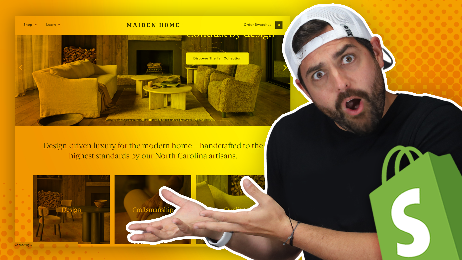
Let's move on to our numero quatro store. We have a maiden home.

A couple of things I liked about this site are very simple. It's very clean, and their navigation is also very, very simple. We either have a shop

and it gives you sofas, beds, sectionals, chairs, tables and it gives you an image. I love these mega menus. By the way, if there's any way that you can use these mega menus in your store, use them. They're awesome. And then you also have this whole Learn, right?

So instead of having our story and quality and reviews and journal the blog all listed out of the very top or even at the bottom of the footer, they have a very concise navigation with shop and learn.

Awesome. Love it. Very clean. Let's go to the sofas. OK, so here we have sofas.

We have a little blurb of the sofas

and then some of them are pretty cool about this. Just like the bikes, these are a little bit. You can customize them a little bit, right? So they're kind of modular. You can choose different fabrics, different colors, different configurations, etc. So for example, for this one, The Muir Sofa, there are fifty two fabrics, seven finishes and four sizes, so that's actually pretty cool.

They've sort of condensed. Instead of having potentially hundreds of products just littering all their websites, they've sort of condensed everything into this is the Muir Sofa and you have 52 fabric, seven finishes and four sizes.

That's a bunch of variants for just that product, whereas in other stores, they may feel compelled to split this product and say the muir sofa large, the muir sofa medium, whatever. But they sort of condense everything into one product where you have a lot of different variations. And I really like the way that they break down the variations. So it's super, super easy for the consumer, so it's always paying attention to how the consumer would shop for this product. That's important. That's the important part. And that's how you should be able to set up your store by paying attention to how the customer actually shops.
I love this breakdown of how this comes up a little bit on the actual product image. As you can see, we have all the other product images over here.

You can flip through them very, very clean. Very beautiful. And then here on the left hand side, as we can see, we had all those options for the variations.

And you can very quickly. One, they have different categories for the fabrics. They have so many, I believe it was 52. So we have the performance chanille, you can click on that one, harbor for example, the wood finish, pecan, coffee, charcoal, white wine and then the size of the actual couch.

You can do 100 inches wide

and the configuration either arm on the left or arm on the right.

So all of those options to pick your variation? Really? And then after you're done making the selections, you just click on add to cart

and that will have all your specifications, right? So the hundred inches harbor a charcoal couch.

Yeah. I just wanted to show you this, because even with a very complex item like the sofa, with all these configurations and variations, they've made it super simple for the customer to be able to shop their products. So that's something just to take into consideration when you're setting up your store, setting up your products, how your customer actually shops for your products. Again, making it simple is definitely the way to go.
All right, that's it for this video. If you enjoy this video, go check out this other one.

It's Called Amazing Shopify Store Review.
It's in the details. I do another breakdown of some popular Shopify stores, and I want to say make sure to comment down below, we got some stores you want us to review.
Let us know, right?



Share:
The Ultimate Guide for Website Design for Clothing Boutique
Brand Marketing: Grow Your Clothing Boutique’s Social Media Presence!