If you’ve ever wished a seasoned Shopify expert would take a hard, honest look at your clothing brand’s website and tell you what’s wrong with it — and more importantly, how to fix it — this is your chance to learn from the best.
In a recent video, Christian Pinon, co-founder of BitBranding and an expert who’s helped over 300 clothing brands scale online, dove into live audits of five Shopify stores submitted by real business owners. The feedback is sharp, real, and full of actionable gold. Whether your store is just launching or already scaling, this “roast” is a masterclass in Shopify UX, branding, and conversion strategy.
Let’s break down the biggest takeaways, brand by brand — so you don’t make the same mistakes.
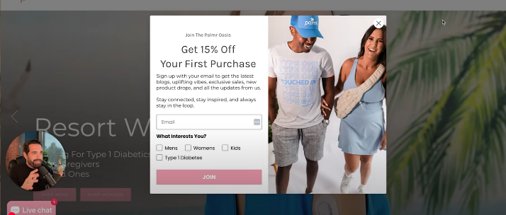
1. PalmerStyle.com – When Clean Design Becomes Cluttered
Christian starts by taking a swing at Palmer Style’s welcome pop-up — and it’s a jab that lands.
What went wrong:
-
The offer ("50% off your first purchase") is solid, but it’s buried under a wall of text.
-
Call-to-action? Weak. “Join” is vague. “Get 50% Off” would convert better.
-
The homepage slider is another misstep. It rotates too fast, not giving visitors time to process what they’re seeing.
What went right:
-
Navigation is top-notch. Clean, categorized by gender and item type.
-
Product photography looks professional.
-
Use of reviews and social proof is decent, but placement could be better.
-
Loved the user-generated content gallery. Christian said, “Forget the Instagram feed — this is the best social proof you can have.”
Key takeaway:
Keep it simple. Prioritize clarity over clutter. And kill the autoplay slider.
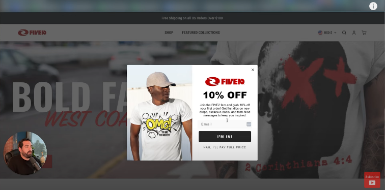
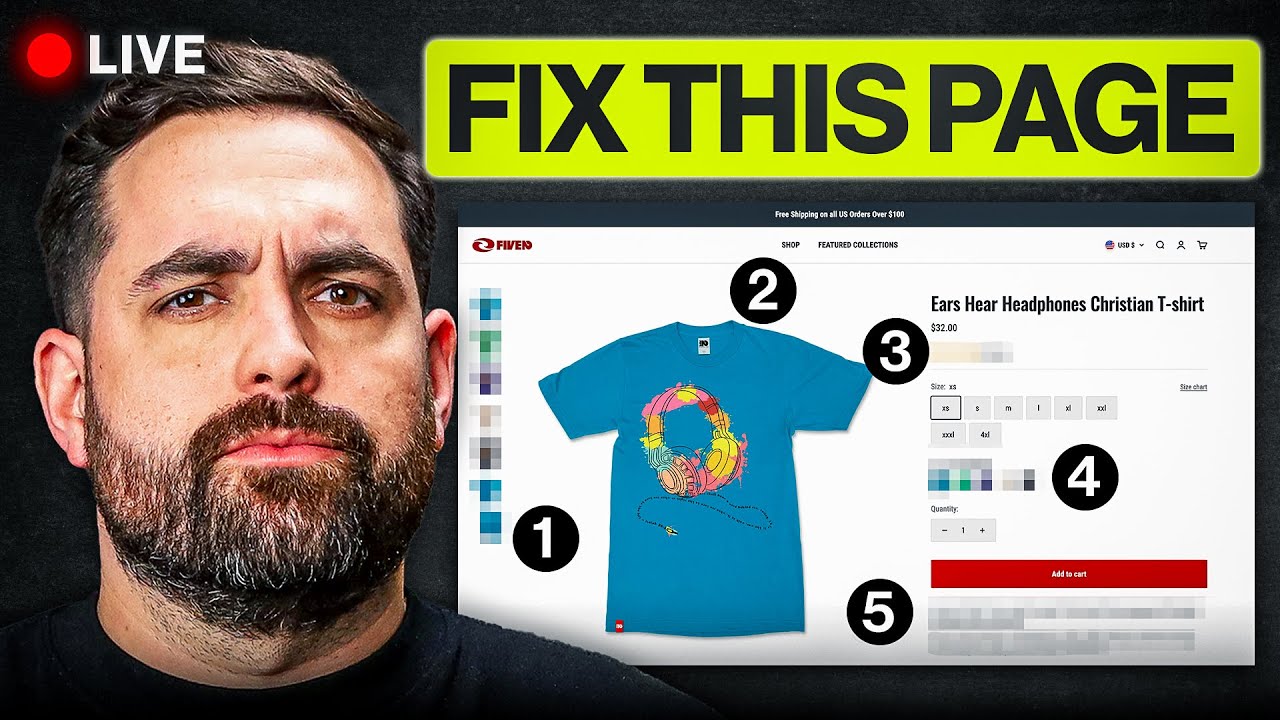
2. FiveTwoEcho – Great Design, But Sounds Like Everyone Else
FiveTwoEcho, a Christian clothing brand, makes a solid visual impression — but falls into the trap of default Shopify copy.
What went wrong:
-
Phrases like “Featured Collections” scream default theme. Christian calls it “giving me the ick.”
-
The “From $32” pricing creates unnecessary ambiguity.
What went right:
-
Pairing graphic elements with product photos is a design win.
-
Use of trust badges and floating cart is great.
-
Size chart includes actual text (good for accessibility), and model fit details are included — a best practice for apparel.
Key takeaway:
Design is great, but copy needs a voice. Get rid of template text and speak to your audience like a real brand.
3. Little Rat Things – Strong Identity, Minor Execution Flaws
As a kids' clothing brand, Little Rat Things nails its branding. But even great brands have blind spots.
What went wrong:
-
Product images are blurry and clipped.
-
Some hover effects are inconsistent.
-
The logo lacks the full brand name, which could hurt brand recall.
What went right:
-
Navigation is perfect. Nearly every menu item leads to a product.
-
The “Mystery Discount” popup is a clever way to drive engagement.
-
Hovering on products reveals lifestyle imagery — a UX win that boosts trust.
-
Size guides are present and informative.
-
Trust badges are brand-specific, not generic.
Key takeaway:
You’ve nailed the brand vibe — now polish the details and bump up image quality for a more premium feel.
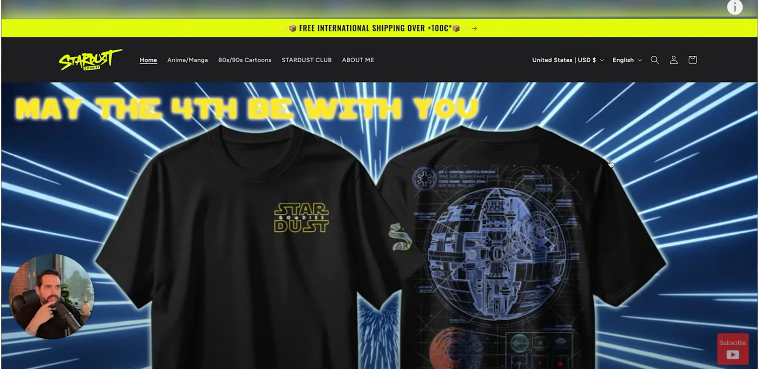
4. StardustAndGoodies.com – Free Theme, But No Excuses
This brand uses Shopify’s Dawn theme, and it shows. But that doesn’t mean it can’t be optimized.
What went wrong:
-
Product titles are inconsistent — some don’t include whether it’s a shirt or hoodie.
-
Hero banner is blurry and too tall.
-
No strong call to action.
What went right:
-
“Hover to reveal model photo” is smart. Great way to show the fit.
-
Good use of front/back design visibility.
-
Interactive “What’s my size?” tool adds real value, although the Spanish language setting caused confusion.
Key takeaway:
Your theme doesn’t matter as much as consistency. Clean up your product titles, CTA buttons, and image clarity.
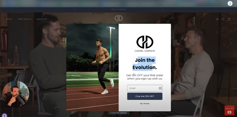
5. DanielDarwin.com – Big Ideas, Weak Execution
Daniel Darwin has a bold look but lacks the clarity needed to convert.
What went wrong:
-
Homepage messaging is vague. “Live Free. Be Awesome.” doesn’t explain what the brand sells.
-
“Free Souls” section is confusing — is it community, ambassadors, or just a lifestyle aesthetic?
-
Too few products shown above the fold on collection pages.
What went right:
-
Product pages offer solid feature breakdowns.
-
The storytelling potential is strong — the product benefits are clear and well-organized.
-
Great call-to-action buttons on the product page.
-
Solid add-to-cart strategy, although the “View Cart” button should be removed to keep the path to purchase frictionless.
Key takeaway:
Big branding ideas are great — but if visitors can’t tell what you’re selling in five seconds, you’ve already lost them.
Best Practices from the Roast: Apply These to Your Store Today
If you’re not one of the audited brands, here are some of Christian’s best tips that apply across the board:
🔥 Replace “Featured Collection” with Meaningful Copy
Avoid default theme language. Say something that actually describes what the user is about to see — like “New Summer Drops” or “Faith-Inspired Streetwear.”
📸 Use Real Photos of Customers
Ditch the polished-only look. Lifestyle shots featuring real customers wearing your products should be on every page. Add a UGC gallery to your homepage and collection pages.
📱Optimize for Mobile Clutter
Popups, live chats, loyalty widgets — they add up fast. Make sure mobile users aren’t overwhelmed.
💬 Size Charts Need Context
Include text-based size guides with visual measurement indicators. Talk about fit, model specs, and sizing nuances to reduce return rates.
🛒 Remove Unnecessary Cart Options
Christian recommends eliminating the “View Cart” button. Once they’ve added to cart, guide users straight to checkout. No distractions. No detours.
🧭 Use Navigation to Drive Sales
98% of your header links should point directly to products. Use your top bar as a sales tool, not just an info hub.
🧠 Give Each Product a Voice
Don’t just list features. Explain them. Why should I care about the “hidden card pocket” or “double-stitched collar”? Show me. Tell me. Help me imagine it.
Final Thoughts: Don’t Take It Personally — Take It to the Bank
Getting “roasted” by a Shopify expert may sting at first, but these hard truths are what separate hobbyists from serious eCommerce brands. If Christian’s critiques hit close to home, that’s a good thing — it means you have room to grow.
Want to level up your own clothing brand? Christian and his team offer free 45-minute strategy sessions to help you scale profitably. You can also catch more audits and tutorials on their YouTube channel.
In the end, the only thing worse than hearing tough feedback is not hearing it at all. So if your site got called out today, take it as a compliment: you’re in the game — now it’s time to play to win.
Ready to see your brand roasted (and rebuilt)?
Drop your link in the comments of Christian’s latest video and get in line for the next live audit session. Your brand might be next — and that’s a good thing.


Share:
Clothing Brands Are Stealing This Strategy to Grow Fast
600 Brands. Millions in Sales. This Is What’s Winning: Organic or Paid?