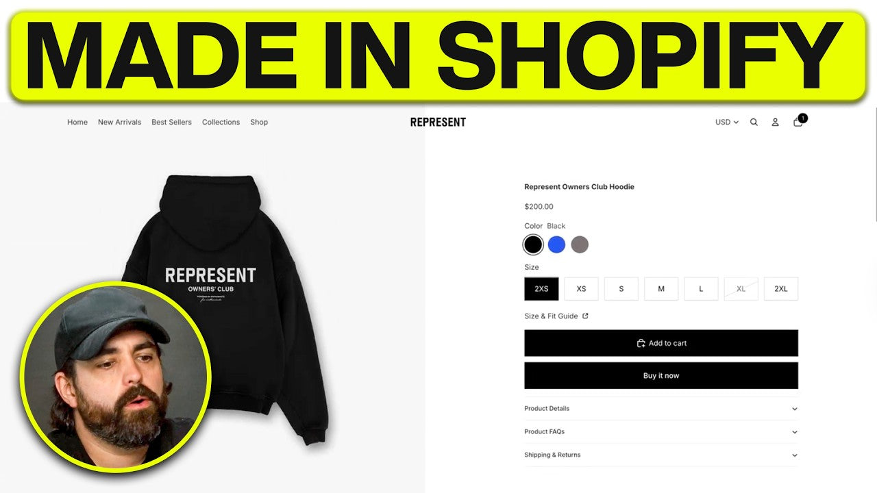
If you want to understand why some fashion brands convert browsers into buyers so efficiently, start with the product page. That is where hesitation either gets removed or amplified. In the case of REPRESENT, the product page is not treated as a basic storefront template. It is treated like a carefully engineered buying environment built to create confidence, desire, and momentum. The transcript behind this breakdown shows that the page follows a deliberate structure built around urgency, premium presentation, and reduced friction, while also proving that much of that experience can be recreated inside a free Shopify theme with the right strategy.
Most brands get this wrong. They upload a few images, paste in a generic description, add an Add to Cart button, and assume the job is done. But a high-converting product page does much more than display a product. It tells a story, answers objections, guides the eye, signals brand value, and makes the decision to purchase feel easier. That is exactly what makes REPRESENT’s approach so effective.
In this article, we will break down the core ideas behind rebuilding REPRESENT’s product page from scratch, explain why the page feels so premium, and show what ecommerce brands can learn from this process when designing their own Shopify stores.
Why Product Pages Matter More Than Most Brands Realize

For many ecommerce stores, the product page is the final checkpoint before a customer buys or leaves. A strong homepage can create interest. A clean collection page can help shoppers browse. But the product page is where trust is tested.
This is where customers ask themselves:
-
Is this worth the price?
-
Will it fit me?
-
Does this feel premium?
-
Can I trust this brand?
-
What happens if I need to return it?
-
Do I want this now, or can I wait?
A weak product page leaves those questions unanswered. A strong product page answers them almost invisibly.
That is why REPRESENT’s product page stands out. It looks clean and simple on the surface, but underneath that minimal design is a tightly controlled system. The typography, spacing, image placement, fit guidance, review positioning, and section hierarchy are all designed to remove hesitation and reinforce brand value.
Product pages are one of the most important components of ecommerce conversion optimization because they directly influence purchasing decisions. While traffic generation matters, many brands discover that improving product page optimization delivers a larger revenue impact than increasing visitor numbers alone. This is especially true for fashion brands competing in crowded ecommerce markets.
The 3-Part Strategy Behind REPRESENT’s Product Page

One of the most useful takeaways from the transcript is the idea that REPRESENT uses a three-part strategy on its product page: urgency, desire, and a premium brand experience. Even if those exact labels are simplified, the structure is clear.
1. Brand Experience - Trust
This is where REPRESENT separates itself. The product page feels like an extension of the brand, not a default Shopify template. Everything is designed to feel intentional. Minimalism is not empty. It is controlled. Every element contributes to the perception of luxury.
2. Urgency
Urgency on premium fashion sites is often subtle. It is not always a flashing countdown timer or aggressive discount popup. Instead, it can come from cues like limited sizing, elevated presentation, quick-buy options, and a streamlined purchase flow. The customer gets the sense that the product is desirable, refined, and worth acting on now.
3. Desire
The page immediately creates desire through visuals. Customers are not just shown a plain product image. They see a gallery with a mix of flat-lay product shots, clean detail images, and lifestyle imagery of a model wearing the item. That combination helps shoppers understand both the technical product details and the aspirational feeling around the product.
The product is not presented as a commodity. It is presented as part of a lifestyle.
Why Most Product Pages Fail

Most brands treat the product page like a formality. They throw on a description, add a cart button, and move on. That is the opposite of how premium brands operate.
Here is where most product pages break down:
They rely on default layouts
Default templates rarely create a premium impression on their own. They are functional, but they are not strategic.
They use weak product copy
One of the clearest points in the transcript is that the biggest mistake across hundreds of brands is not necessarily the design. It is the words. Weak copy kills conversion. Brands describe what the product is, but not why it matters, how it feels, how it fits into the customer’s life, or why it is worth buying.
They overwhelm or underwhelm
Some pages are cluttered with too much information all at once. Others provide too little. Premium product pages know how to reveal the right amount of information at the right moment.
They fail to answer objections
Sizing confusion, unclear shipping policies, weak return messaging, and vague fit information all create friction. REPRESENT’s page handles these better by structuring details into accessible sections and keeping the experience clean.
What Makes REPRESENT’s Product Page Feel Premium

One of the most interesting observations in the transcript is that the page feels minimal, but every element is doing heavy lifting. That is exactly what premium design looks like. It is not about adding more. It is about refining what stays.
Beyond aesthetics, this approach supports Shopify conversion rate optimization by making it easier for shoppers to find information and make confident decisions. Many successful Shopify CRO strategies focus on removing friction rather than adding more features, and REPRESENT's product page is a strong example of that principle in action.
Clean visual hierarchy
A premium page directs the eye without feeling noisy. The shopper knows where to look first, second, and third.
Smaller, controlled typography
The transcript highlights how the smaller font sizing contributes to a luxury feel. Large, loud typography can sometimes feel more promotional or mass-market. Smaller, sharper type treatments often create a more editorial, elevated impression.
Intentional spacing
Spacing is one of the least appreciated conversion tools in ecommerce design. REPRESENT’s product page uses contained widths and balanced spacing so the details feel organized and breathable. That sense of order reinforces quality.
Sophisticated imagery
The mix of model shots, flat-lay images, and close-up detail photography helps the customer feel informed and inspired at the same time.
Sharp interface choices
Rounded corners, bulky selectors, and generic buttons can make a page feel more casual. The transcript specifically points out the shift to sharper edges and more refined controls to align the experience with a luxury brand aesthetic.
Breaking Down the Live Product Page Experience

The page elements called out in the transcript reveal a clear playbook for premium apparel brands. Among the notable features are:
-
Variant swatches or size options
-
A size and fit guide
-
Product details and care or materials information
-
Shipping and returns information
-
Reviews placed high on the page
-
Model-wearing visuals
-
Detailed gallery imagery
-
Complementary product suggestions
-
“You may also like” recommendations
-
Recently viewed items
This matters because every one of those sections does a different job.
Reviews build trust.
Fit guides reduce hesitation.
Detailed images answer quality questions.
Cross-sells increase average order value.
Recently viewed products keep the browsing loop alive.
That is what a strategic product page looks like. It is not just a page. It is a conversion system.
Product Page Optimization Is More Than Design
One reason REPRESENT’s page performs so well is that it treats product page optimization as a complete customer experience rather than a visual upgrade. Every element, from image hierarchy and sizing information to reviews and purchase flow, is designed to remove friction and guide shoppers toward a decision. This is the foundation of effective ecommerce conversion optimization. When brands focus on reducing uncertainty instead of simply adding features, they create a smoother path to purchase and a stronger overall shopping experience.
Can You Recreate This with a Free Shopify Theme?

Yes, to a meaningful extent.
One of the most valuable insights from the transcript is that while some app-based or custom-coded elements may not be fully reproducible inside a free theme, a surprisingly strong version of the experience can still be built using Shopify’s free Horizon theme and smart configuration.
That is encouraging for growing brands. You do not need a massive custom development budget to improve your product page dramatically. You need a clear vision, knowledge of the available theme settings, and a willingness to shape the experience intentionally.
This is particularly true when brands combine thoughtful Shopify theme customization with a clear understanding of user behavior. Strategic customization allows store owners to create a premium experience without the expense of a fully custom build.
Step 1: Use the Default Product Template Properly
A key technical point in the transcript is that the product template is usually shared across multiple products. That means when you edit the default template, you are often editing the experience for every product assigned to it.
That matters for two reasons:
-
First, you need to be thoughtful. A change is rarely isolated.
-
Second, you need to build a scalable structure. If your layout relies too heavily on static content, it becomes harder to manage across a larger catalog.
This is why a good product page setup combines shared design logic with product-specific content fields.
Step 2: Match the Layout Structure
The layout work described in the transcript focuses on getting the fundamentals right:
-
Equal column balance
-
Product media on the left
-
Product information on the right
-
Carousel-enabled gallery
-
Square or nearly square image aspect ratio
-
Better contained content widths
-
Improved spacing between content elements
These changes seem small, but they transform perception. When the content area breathes, the entire page feels more premium. When the gallery ratio matches the brand reference, the visuals feel more editorial. When the columns are balanced, the design feels deliberate rather than improvised.
Step 3: Make the Header Work with the Product Page
Another subtle premium cue is how the product media interacts with the header. The transcript discusses the importance of the imagery sitting beneath the header area, along with the need to manage transparent backgrounds and logo contrast correctly.
This is a good reminder that premium product page design is not isolated from the rest of the site. The header, navigation, and page framing all affect how luxurious the product feels.
If your logo treatment, navigation weight, or header background clashes with the product imagery, the whole page feels less refined.
Step 4: Refine Typography for a Luxury Brand Feel
Typography is not just about readability. It is about signaling.
The transcript emphasizes using smaller font sizes and bolded but controlled titles to better match REPRESENT’s luxury feel.
Here is why that works:
-
Smaller type often feels more exclusive and editorial
-
Bold accents help anchor attention without overwhelming the page
-
Consistent sizing hierarchy creates order
-
Sharper formatting communicates precision
For apparel brands, typography often does more brand-building work than people realize. Cheap-looking typography makes even good products feel less valuable.
Step 5: Replace Dropdowns with Swatches and Better Variant Controls
Variant presentation matters. If your product options are hidden in dull dropdowns, the page feels more generic. Switching to buttons or swatches makes the selection process more tactile and visually confident. The transcript also highlights the importance of removing unnecessary roundness and cleaning up the selector styling for a sharper, more premium feel.
This is one of those details customers may not consciously notice, but they absolutely feel.
Step 6: Hide Long Descriptions Inside Accordions
One of the smartest moves in the rebuild is replacing the full open product description with organized accordion sections such as:
-
Product Details
-
Size and Fit
-
Shipping and Returns
This is a powerful pattern because it keeps the product page visually minimal while still making key information easy to access.
Open paragraphs dumped onto the page can make apparel product pages feel cluttered and unsophisticated. Accordions solve that by letting information stay available without dominating the interface.
They also align with how modern shoppers behave. Most do not want to read everything immediately. They want to scan, decide, and open the details that matter to them.
Step 7: Use Metafields for Product-Specific Content
This is where the build becomes scalable.
The transcript explains how metafields allow you to create custom backend fields for content that differs from product to product, such as fit notes, additional detail sections, or structured rich text content.
That is critical for serious ecommerce operations.
Without metafields, brands often hardcode content into templates, which becomes messy and difficult to manage. With metafields, you can keep the visual structure consistent while customizing the actual content for each item.
That means:
-
Better product-specific storytelling
-
Cleaner theme management
-
More flexible templates
-
Stronger merchandising at scale
For Shopify brands trying to look premium without becoming unmanageable, metafields are a major unlock.
The Role of Shopify Theme Customization
A premium shopping experience rarely comes from using a theme exactly as it was installed. Strategic Shopify theme customization allows brands to create more personalized product experiences while maintaining scalability across their catalog. Whether through metafields, custom content sections, or improved product templates, thoughtful customization helps a clothing brand Shopify store stand out while keeping the customer journey consistent and easy to navigate.
For any clothing brand Shopify store, metafields create a more scalable way to manage unique product information while maintaining a consistent shopping experience. They are also commonly used during Shopify development services projects to support advanced merchandising and content management needs.
Step 8: Add a Size and Fit Guide the Right Way
Fit anxiety is one of the biggest conversion killers in fashion ecommerce. If customers are unsure about sizing, they hesitate. If they hesitate, they leave.
The transcript shows how REPRESENT includes a visible size and fit guide, and how a close approximation can be created in a free theme, even if the exact placement or styling differs.
That matters because a fit guide does more than answer questions. It lowers the emotional cost of buying.
A good size and fit section should ideally include:
-
Model height and size worn
-
Fit style, such as oversized, regular, or slim
-
Measurement reference points
-
Fabric stretch context
-
Guidance for customers between sizes
The more confidently a customer can answer “Will this work for me?”, the more likely they are to buy.
Step 9: Remove the Quantity Selector
One subtle but important choice in the rebuild is removing the quantity selector. REPRESENT does not emphasize quantity selection on the main purchase area, and the transcript notes that many brands are moving away from it.
Why?
Because it removes a small but real distraction.
Most shoppers are buying one unit of a fashion product at a time. Letting them adjust quantity later in the cart simplifies the primary action on the product page. Instead of asking the customer to make one more decision, the page keeps them focused on the purchase itself.
Step 10: Build a Lower Image Carousel to Reinforce the Sale
One of the strongest conversion ideas in the transcript is the additional image carousel placed lower on the page. This section acts as a second wave of persuasion. If the customer scrolls past the initial gallery and still has not decided, the lower carousel gives them more visual evidence and product detail.
This is smart for several reasons:
-
It re-engages attention deeper in the page
-
It offers close-up detail images
-
It reinforces quality perception
-
It keeps the product central before recommendation modules take over
For many brands, the lower half of the product page is wasted. REPRESENT-style strategy uses it to continue the argument for purchase.
How to Increase Conversions on Shopify Without a Complete Redesign
Many store owners assume they need an entirely new website to improve performance. In reality, some of the highest-impact changes involve refining existing product pages. Better product imagery, clearer fit guidance, stronger product descriptions, and improved information hierarchy can all contribute to higher conversion rates. For brands wondering how to increase conversions on Shopify, optimizing the buying experience is often more effective than constantly chasing new traffic.
Product Page Optimization Requires More Than Better Design
Effective product page optimization combines design, content, usability, and customer psychology. Brands looking for how to increase conversions on Shopify often focus heavily on traffic acquisition, but improving the buying experience can generate meaningful gains without increasing advertising spend. This is one reason product page optimization remains a core focus of ecommerce conversion optimization efforts.
The Biggest Mistake: Weak Product Copy

Perhaps the most important lesson in the entire transcript is the final one: the biggest issue across hundreds of brands is not necessarily page layout. It is a product copy.
That is worth repeating.
Bad product copy can destroy a beautiful page.
If your words are flat, generic, vague, or overly technical, your customer feels less. And if they feel less, they buy less.
Great product copy should do at least five things:
1. Translate features into value
Do not just say what the garment is made of. Explain what that means for comfort, wearability, durability, or feel.
2. Reinforce the brand voice
Luxury streetwear should not sound like a generic catalog.
3. Reduce uncertainty
Copy should support the visuals by clarifying fit, quality, intended use, and overall product confidence.
4. Increase desire
The right words can make a product feel more distinct, more considered, and more worth owning.
5. Support conversion without sounding desperate
Premium brands do not beg for the sale. They build confidence until the sale feels natural.
What Ecommerce Brands Should Take from This
Rebuilding REPRESENT’s product page from scratch is not really about copying another brand pixel for pixel. It is about understanding the strategic principles behind the page.
Those principles are:
-
Minimal does not mean basic
-
Premium design is often about restraint
-
Layout should reduce hesitation
-
Strong imagery creates desire
-
Smart content structure improves clarity
-
Metafields make premium templates scalable
-
Fit information lowers friction
-
Typography and spacing influence perceived value
-
Good copy is as important as good design
-
Even free Shopify themes can go much further than most brands realize
If you apply those ideas well, your store can feel dramatically more polished without needing to rebuild everything from scratch with expensive custom development.
Applying These Principles to Your Own Shopify Store
Whether you are launching a new brand or refining an existing store, the lessons from REPRESENT extend far beyond a single product page. Successful ecommerce website design combines strong branding with conversion-focused user experiences. At BitBranding, these same principles are often applied through Shopify design services and Shopify development services that help brands create more effective shopping experiences. The goal is not simply to make a store look better, but to build a product page structure that supports long-term growth and stronger ecommerce performance.
Final Thoughts
The best product pages are not accidents. They are engineered. REPRESENT’s product page works because it blends aesthetic control with conversion logic. It looks calm, but it sells hard beneath the surface. It creates desire, reduces friction, answers objections, and supports the customer all the way to checkout.
That is the real lesson here.
You do not need to fill the page with noise. You need to make every element count.
If your current product page feels generic, cluttered, or underperforming, start by fixing the fundamentals: layout, typography, image hierarchy, fit guidance, content structure, and copy. Those improvements can change the entire perception of your brand.
And if you want expert guidance on what is working, what is not working, and how to turn your product pages into stronger conversion assets, schedule a strategy session here:


Share:
Why $550K in Inventory Made $1,000 (Clothing Brand Mistakes)
How Sydney Sweeney Launched a Lingerie Brand the Right Way