If you’re running an online clothing store, chances are you’ve asked yourself, “How do I improve my website’s conversion rate?” As a Shopify expert who’s helped over 250 clothing brands boost their sales, I’ve seen what works—and what doesn’t. In the last year alone, we’ve helped these brands generate over $10 million in extra revenue through smart website optimization, advertising strategies, and email marketing.
In this post, I’ll walk you through some key insights gained from reviewing websites, highlighting common pitfalls and providing actionable tips that can help you improve your online store. Let’s dive into three real-life examples to see what these brands are doing right—and where they could improve.
Common Conversion Challenges
Before we look at specific sites, it’s important to understand a key metric: the average conversion rate for online stores is around 2.2%. That means out of every 100 visitors to your clothing store, only about two or three people make a purchase. Small improvements in user experience can increase that number, leading to significant revenue growth over time.
Here are the most common issues I see when auditing clothing brand websites.
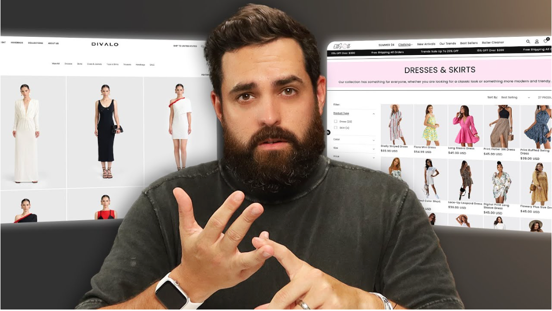
Example 1: SilvaSpas.com
First Impressions Matter One of the first things I noticed when visiting SilvaSpas.com was an immediate pop-up offering 10% off. While pop-ups can be useful for capturing emails, launching them the moment a user lands on the page can be off-putting. New visitors haven’t had a chance to explore the brand or understand what it offers, so bombarding them with discounts right away can feel pushy.
Solution: Delay pop-ups until a user has scrolled about 30-50% down the homepage or interacted with the site. This gives them time to learn about the brand, making them more likely to provide their email when they’re ready.
Cluttered UI SilvaSpas.com also features floating icons, like a 10% off bubble and a cart icon, that overlap each other. This looks cluttered and unprofessional, especially on mobile devices.
Solution: Clean up the user interface by spacing out these elements and ensuring they don’t overlap. On mobile, simplify the layout even further to avoid overwhelming the user.
Branding Consistency The homepage lacked consistency in terms of color scheme and typography. There wasn’t a logo on display, and random blue elements contrasted with other page elements, creating a disjointed experience.
Solution: A cohesive brand identity is critical. Make sure your fonts, colors, and logo are in harmony to provide a visually appealing experience.
Example 2: Dealo.com
Strong First Impressions Dealo.com made a much better first impression, with a high-quality video in the hero section and a clean, black-and-white color scheme. This gave the brand an upscale, polished feel.
However, be cautious about video use on homepages. While visually appealing, videos can slow down site performance, especially for mobile users. Slow loading times can lead to a higher bounce rate.
Solution: If you must use videos, ensure they are optimized for fast loading, or consider using a static hero image to convey your message.
Trust Badges and Legal Pages Another thing Dealo.com did well was including essential legal pages like terms and conditions, privacy policy, and shipping information in the footer. This helps build trust with potential buyers.
However, one trust badge—"Secure Payments"—felt unnecessary. Most consumers assume payment security by default these days.
Solution: Instead of overusing generic trust badges, highlight payment options like Klarna or Afterpay, which give customers flexible payment choices, increasing the likelihood of a sale.
Example 3: Lou.com
Overloading the Customer Lou.com had several strong features, like best sellers and new arrivals displayed prominently on the homepage. These sections automatically update as products change, making the site feel fresh every time a customer visits.
However, there was an issue with too many competing elements. A pop-up for 20% off appeared immediately, along with a cookie consent banner and scrolling banners. This overload of information can confuse users and divert their attention from what really matters: your products.
Solution: Simplify your homepage. Reduce the number of distractions and streamline the user’s path to make it easier for them to explore your products. Instead of multiple banners, focus on one core message—like free shipping or a single promotion.
Leveraging Social Proof None of these sites had enough social proof, which is crucial for building trust and convincing potential buyers. Dealo.com and SilvaSpas.com had star ratings but lacked actual reviews on product pages. This missed opportunity leaves customers uncertain about whether they should purchase.
Solution: Add customer reviews and user-generated photos to your product pages. Seeing real customers using your product reassures potential buyers and boosts conversions. Aim to gather reviews by implementing automated review requests via email or SMS after a purchase.
Actionable Tips for Every Clothing Brand’s Website
After reviewing these sites, here are the top five things every online clothing brand can implement to boost conversion rates:
-
Delay Pop-ups: Don’t overwhelm new visitors. Let them explore the site before asking for their email.
-
Clean Up Your User Interface: Keep your site simple and easy to navigate, especially on mobile.
-
Consistent Branding: Use a cohesive color scheme, font style, and logo to establish a recognizable brand identity.
-
Leverage Social Proof: Include customer reviews and user-generated content on every product page.
-
Focus on Trust and Transparency: Include essential legal information and payment flexibility options that encourage trust and convenience.
Conclusion: Constant Improvement is Key

Conversion optimization is not a one-time event; it’s an ongoing process of constant improvement. Small tweaks like improving page load times, adding more customer reviews, and streamlining your homepage can increase your conversion rate by 1% or more every month.
If you’re looking for personalized feedback on your own store, drop a link in the comments. We’ll review your website live and provide actionable advice to help you boost conversions.
Did you find these tips helpful?


Share:
How I Made Millions on Instagram for Clothing Brands with Zero Followers
How to Grow Your Clothing Store Fast: A 12-Month Shopify Plan